The Evolution of a Color Palette - Inspired by Frida Kahlo

Frida Kahlo.
Painting by
Howie Green.www.howiegreen.com

The Courtyard of Frida Kahlo’s home in Mexico City. Photograph by Carl Campbell https://www.flickr.com/photos/carlbcampbell/1761627113
A Starting Point…….
The most important way to start a color palette is with a strong inspirational source. This can be driven by a favorite painting, a dreamt-of travel destination, a colorful shawl…… anything that fills you with happiness. Of course, it needs to be an inspiration that you know you want to live with for a period of time!
I have loved Frida Kahlo’s work since I discovered it as an art student a thousand years ago! The sense of color displayed in her house shows an exuberance and confident use of color that projects an over-sized personality. It’s certainly not for the faint of heart!
For color devotees, this inspiration allows color to have free rein but can also be controlled to be a simpler color palette for your home.

Frida Kahlo’s house in Mexico City. Photograph by Rod Waddington, https://rodwaddington.com/
The Frida scheme is made up of intense, saturated bright colors. As a color consultant, I am inspired by the brilliant hues used in her home in Mexico city - intense cobalt, scarlet and red earth, yellow, and emerald.
But the palette doesn’t have to slavishly follow the inspiration point. There is an opportunity to mix other colors into this courtyard color scheme. In keeping with the exuberance of the blues, reds, and yellows a secondary palette with accents of fuchsia, deep orange, plum purple and levels of leaf and grass green would be a great complement to the principal palette.
The Beginning……….. gather your inspirational elements.
This can be the most exciting part of a journey through color - the assembly of related elements that inspire and add depth to your theme.
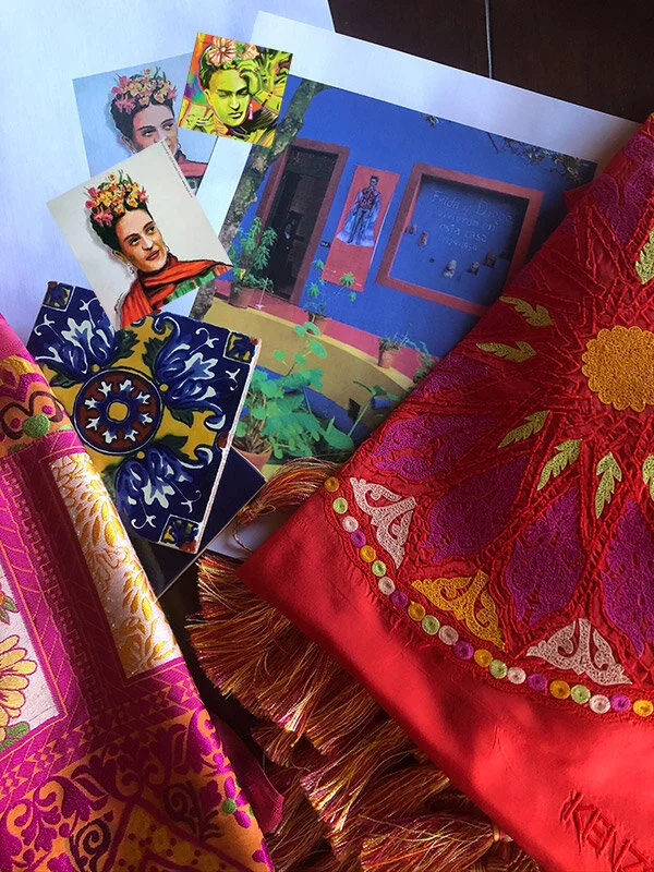
Photographs of Frida Kahlo’s home are a great source of interior and exterior paint ideas. But the palette doesn’t have to follow the inspiration point in every aspect. I always find a color scheme can be enriched by the addition of other elements from textiles, embroideries and tile. There is an opportunity to mix other colors into this courtyard color scheme - both textiles shown here introduce the orange as a vibrant contrast to the fuchsia and yellow. They also suggest, In keeping with the exuberance of the blues, reds and yellows, an earthy red, purple-fuchsia, saffron yellow and light/ mid green as accents complementing the principal colors. Both textiles also make use of ivory which can provide a much-needed calming element for any interior based on such bright colors.
Experimenting with Color Chips
Having reviewed the inspiration points for ideas we can then move onto the fun part - playing with paint chips!

It’s at this stage I keep an open mind about the mixing of colors…… many of the paint companies provide chips that have different levels of, for example, cobalt and yellows that can expand the palette if that’s necessary. If tiles are going to be part of the project this is time I will introduce them… they are also a great source of inspiration and validation of a color scheme that is in development…..
Sorting Into Families of Color
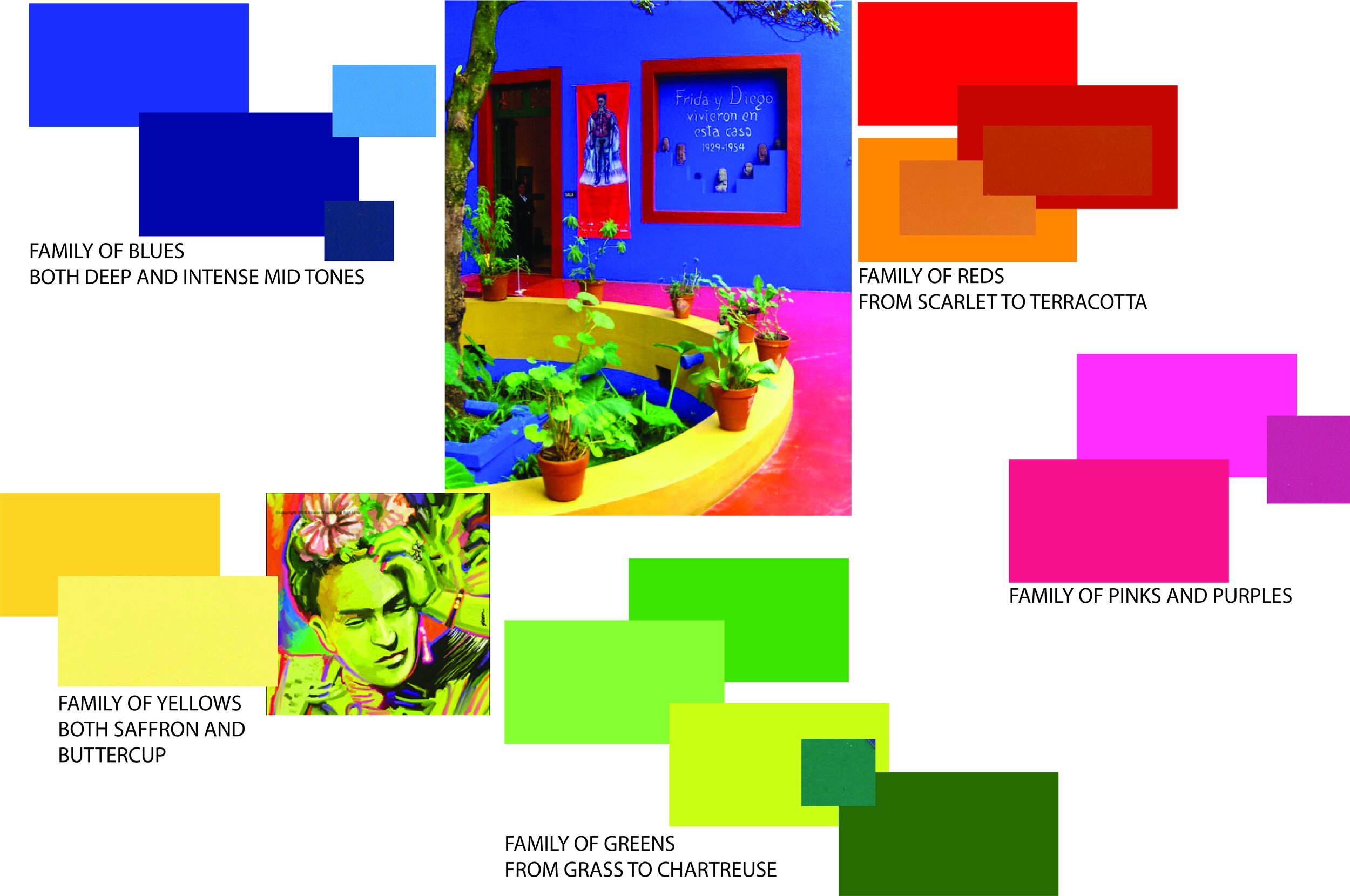
The next stage for me is to make a selection of colors that work with the original inspiration and colors I think might provide other levels for different areas of the house. A brightly-colored scheme might work, for example, in a living/ dining space or bathroom but a more muted version might be necessary for the bedrooms. Levels of color flowing through the rooms can create a sense of continuity……. Above I have sorted my colors into families so I can analyze the balance and levels of color that I have to work with…..
The Palette……………
The following palette has been distilled from the ”families” of color as shown above…………………… a mixing of colors that are directly from the inspirational pieces and other colors that I thought would be a great compliment to them. In acknowledging that this is an extremely saturated palette I have introduced Ivory to provide some point of rest for the eye.
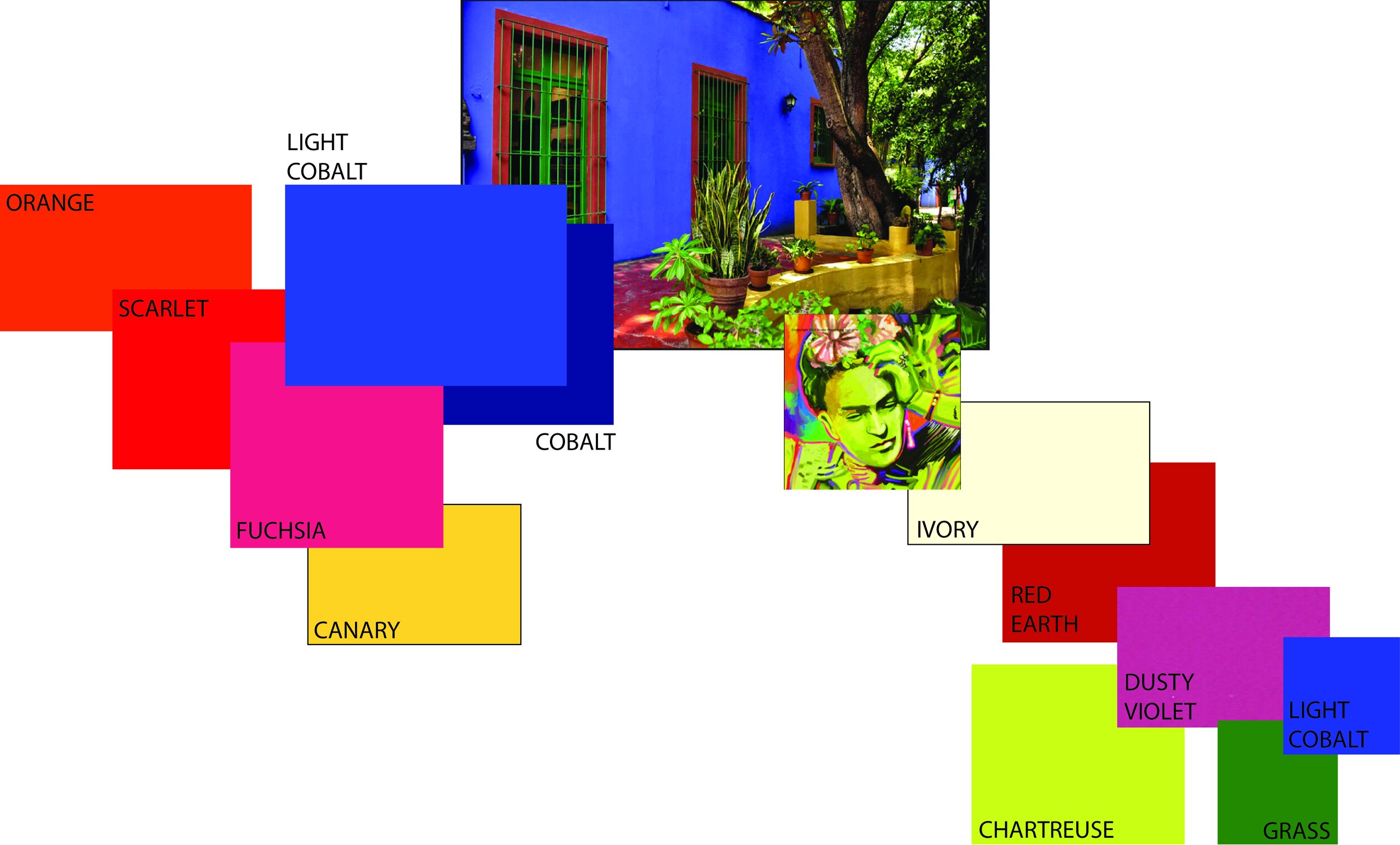
The Palette. Primary palette to the left, secondary palette to the right.
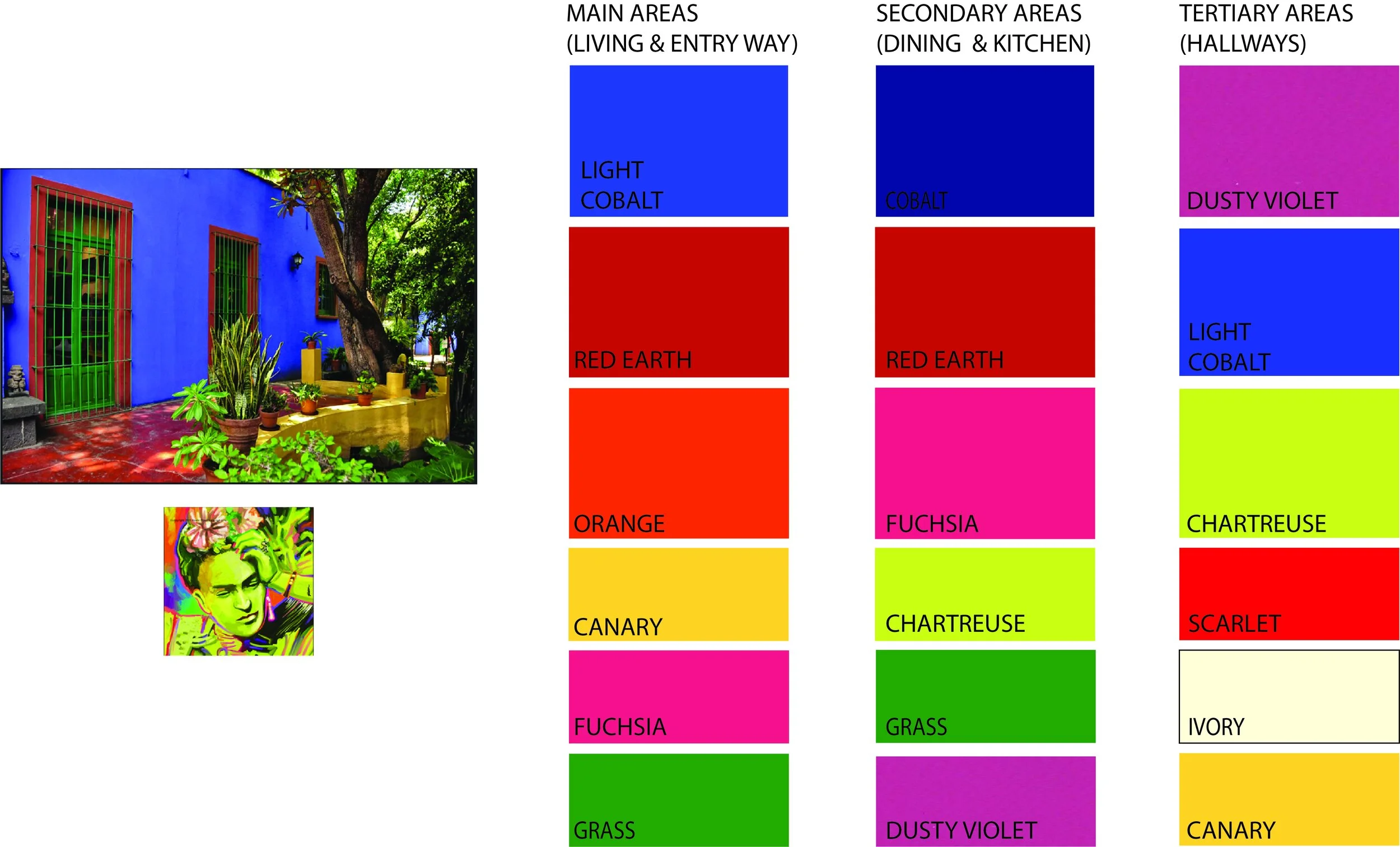
Dividing the Palette for Different Areas of the Home……..
At times, due to the size of the residence and appetite for color, it can be confusing as to how to use a collection of colors in a cohesive way. I find breaking the palette down into smaller mini palettes an easy way to digest the larger color story. In the illustration below I show how I use the colors in an understandable way. The bigger swatches represent the main colors and the smaller swatches are the accent colors. It’s like taking a walk through the home but with color as the driving element….. Main areas such as exterior (for those dyed-in-the-wool Kahlo fans), entryways, and living areas can be colored in the most important colors in the palette. As you move through the dining and kitchen areas the sub palettes come into play. A sense of cohesion is provided by using, for example, the Cobalt as a principal color in one room then its darker cousin in the next area as the palette evolves. Red Earth and Fuchsia die away and are replaced by the accent colors Dusty Violet and Chartreuse which now become the main colors. These were only accents in the previous palette. This helps provide a sense of continuity, a flow, throughout the home.
An Understandable Way to Use this Palette for Bedroom Areas……….
Although this Frida Kahlo palette provides rich color schemes for the living/ dining/ kitchen areas it can be a bit more of a challenge for the bedrooms which, most likely, need to be more restful environments. This is where the lighter tones come into effect and the use of multiple colors is reined in. Each mini palette has only three colors which echo the color schemes from the other areas of the house. This helps provide a sense of continuity throughout the home.
